Logging in without tears
Case Study
Transforming the user experience for account applicants
Users seeking to apply for an account with Silicon Valley Bank (SVB) are first confronted with an old, clunky, strange, sometimes frustrating login experience. We wanted to transform it into a normal, modern, delightful experience.
As a Senior UX Designer on the digital onboarding platform team, I was tasked with
analyzing a reportedly bad login experience for opportunities for improvement
designing a smoother experience to reduce cost to the business
improve the client satisfaction measured by Net Promoter Score (NPS)
Usability audit of SVB’s account application journey
Problem #1: significant friction resulting from reliance on email to enable login
Samantha needs a commercial bank account for her company. She begins at the bank's public website. She expects to initiate her account application. But, instead, she finds that she will have to comply with a time-consuming set of requirements that precede the application process:
Take a survey
Have an interview with an SVB Rep
Respond to multiple emails
Receive an SMS and respond
Submit her online application
Wait for a response (typically, 3 days)
Samantha gets a response via email
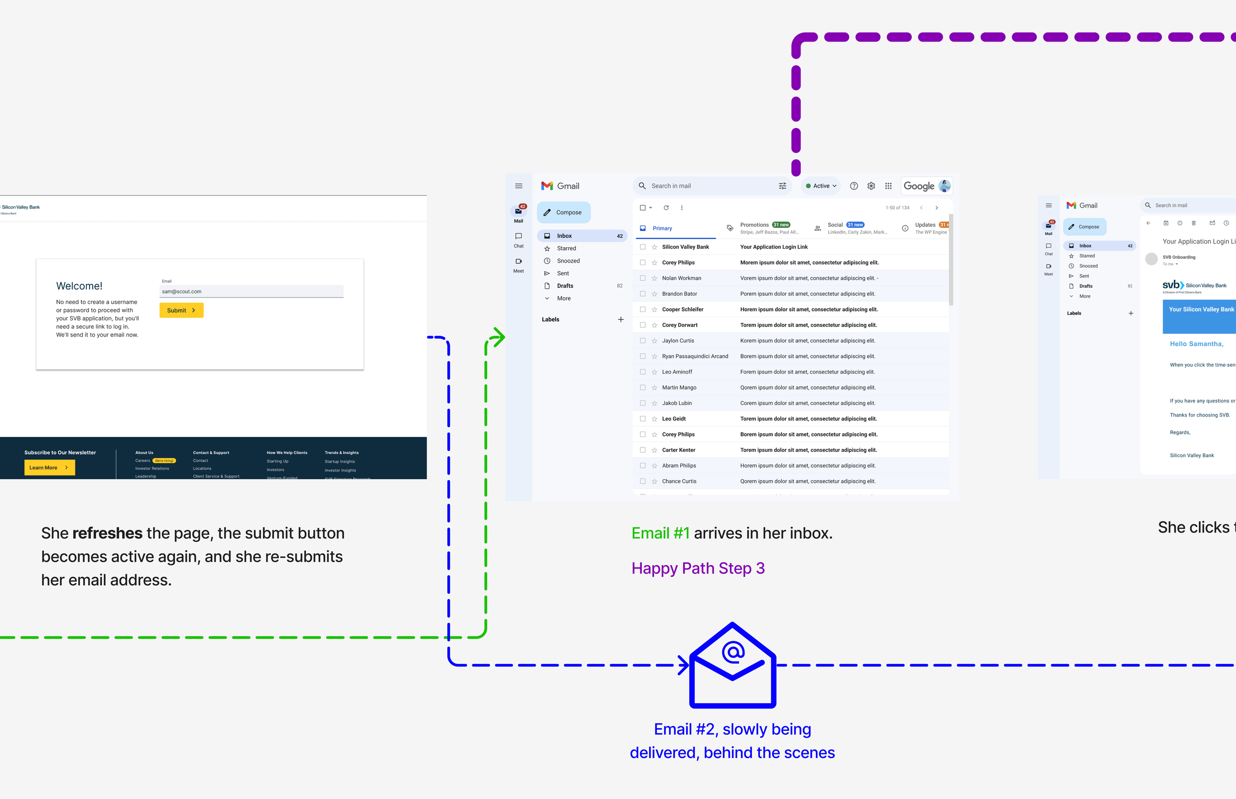
Click through the gallery below to see Samantha’s legacy login experience.


What causes problem #1: significant friction resulting from reliance on email to enable login?
Every time Samantha sends herself an email, it arrives with a valid token that will enable her to receive a one-time passcode to log in. She has no way of knowing that the token will expire quickly, so if she waits too long to respond to the email, her attempt to log in will fail.
If that initial email does not arrive within the time she expects, she may request a subsequent email. Doing so will immediately void the token attached to the initial email. If she repeats the process, then the tokens in all of the previous emails that are in transit or waiting in her inbox are voided.
None contains a warning to respond to only the most recent email. Additionally, bank practices prohibit informing her of how much time she has before the token in the most recent email expires.
If Samantha can thread the needle by avoiding these pitfalls, she will get a one time passcode that enables her to begin the application.
Problem #2: cybersecurity concerns
The experience is puzzling.
Why am I logging in from an email?
Is this secure?
What if someone hacks my email account and gets access to my phone?
Why can’t I create a username and password?
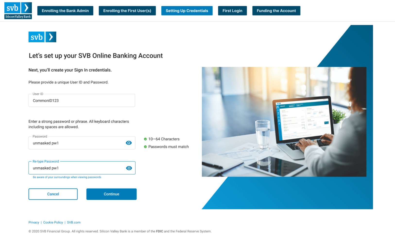
Problem #3: if her account application is approved, Samantha will still need to create a new username and password
Additionally, the login credentials she created for her company's initial banking services will not work when she attempts to add services. She'll need to create new credentials for each new service.
Problem #4: the visual design of the login experience was not modern
Users provided feedback expressing their dissatisfaction with the visual design and user experience. Some stated that they lost trust in the bank’s technological capabilities, as a result.
Designing a Smoother Experience
Creating a modern visual design
Working with my business partners, other designers, content strategists, and technology stakeholders, we decided to focus on these issues:
Create a familiar login experience
Reduce the number of emails to one
Create an experience with a modern look
Competitive Analysis
My team performed competitive analysis by collecting login experiences with a simple flow, a clean uncluttered visual design, and an easily understood journey.
We noticed that the most minimal a familiar login experiences don’t have a photograph or any image on the screen when filling in the user credentials.
We also noticed that there was no welcome text. Welcome text is for closers. The most familiar login experiences reward users with welcome text and an image once they successfully log in, not before.
We decided to remove the image in our new login designs.
Using sections in Figma to create a flow
Instead of jumping into high-resolution, interaction design, we used the new Sections capability in Figma to make a flowchart to illustrate the main interactions. Focusing on one Section at a time, we gradually filled them in with screens and interactions.
Designers new to the project and other stakeholders could see the flow at a glance as it evolved.
Designers new to the project and other stakeholders could see the flow at a glance as it evolved.
Eliminating friction in the user experience:
Unified Login
The use of emails resulted in a frustrating, time consuming, potentially endless and unrewarding user experience that also created security risks.
To improve the user experience in ways that would meet the business needs of the product team, I developed a prototype that elegantly illustrated a modern implementation of single sign on to eliminate many frustrating steps for the applicant.
Emails eliminated by the use of Unified Login
Bold text below indicates emails that were eliminated. The result was a 56% reduction in emails for the happy path and a potentially much larger reduction due to the elimination of the Time-sensitive link email that was part of the vicious loop.
Survey completion
Pre-booking Zoom meeting
Email verification
Start Application
Time-sensitive link
DocuSign
Application under review
Application has been approved
Online banking enrollment (create login credentials)
Business benefits of the improved UX to reduce cost
Ends the vicious email loop; no need to call customer support.
One system for storing one set of credentials per client for all SVB service offerings; elimination of multiple, redundant systems.
Improved client satisfaction builds trust in the brand by keeping unwanted emails out of our clients’ inboxes
Less jumping between web browser, email client, and phone to log in.
One set of credentials to access all of their SVB service offerings.
A familiar, modern process for creating credentials.
Better customer support due to customer support focusing on clients’ higher priority needs.
Figma Prototype
To see the solution in action, check out the prototype below.
There are two flows to try out.
Email to create credentials (bank representative sends the prospect an email to get started)
SVB.com Self-Serve (the prospect initiates their own account creation process with no assistance)


