Simple navigation
Case Study
Transforming the user experience for underwriters
I was the sole designer during the early stages of the B2B startup, Arceo Analytics, that later became Resilience.
Underwriters using Arceo’s Underwriter Platform couldn’t understand which icon button to click to access the PDFs they needed. One button was strictly for generating an Underwriter Report PDF that assessed each clients’ cybersecurity risk ranking, industry, size, and the data sources used to generate the report. The other button only became active when various other PDFs were generated upon submitting various stages of underwriting; price update generated a Quote PDF, justification and workup, generated a Workup PDF, lock generated a Binder PDF. Having two buttons to access PDFs created a frustrating experience for our underwriters. We wanted to simplify experience.
As a Senior UX Designer on the digital onboarding platform team, I was tasked with
researching the problem
analyzing PDF access experience for opportunities for improvement
designing a smoother underwriter experience to underwrite more clients, faster
Usability audit of Arceo’s underwriter PDF access journey
An interview with an underwriter
I interviewed one of the underwriters we had on staff and was able to gather some useful information about her experience when using the underwriter platform.
Because she had been informing the design from the beginning, she understood all of the various steps required to gather information about the client and the PDF reports that became available for export at each step.
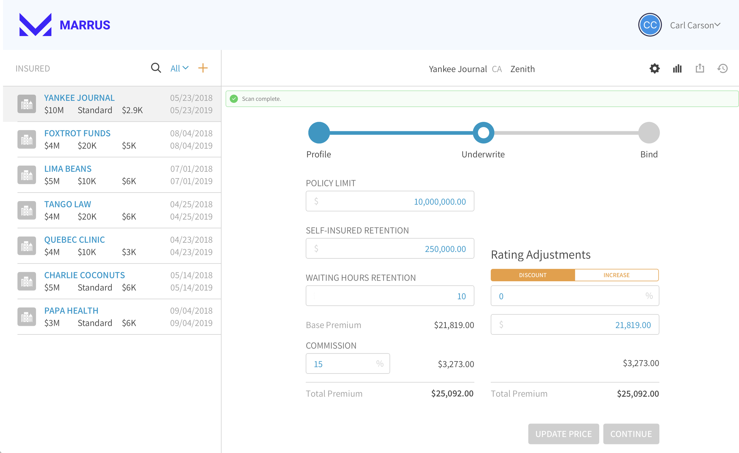
After inputting the client’s Profile information, the system ran a cyber security scan on the client’s presence on the internet, moved to the Underwrite stage in the app, and an Underwriter Report PDF was generated. The Underwriter Report could be exported via the Reports icon button that looked like a bar chart, in the upper right of the interface.
To export a Quote PDF, the underwriter was required to adjust the rate, enter an effective date, an expiration date, a retroactive date, and click the Update Price CTA. All subsequent PDFs could be exported via a dropdown menu under the Share icon button.
2. To export a Workup PDF, the underwriter was required to add a justification for the price update, add a workup that provided additional details about the conversation with the client, and click the Continue CTA.
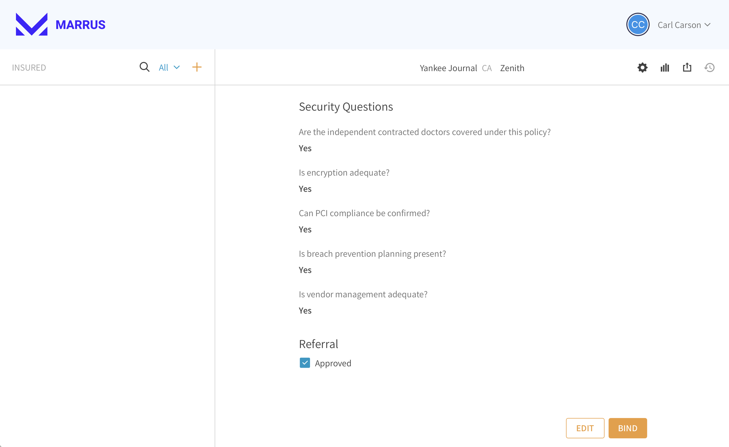
2. To export the Binder PDF, the underwriter was required to answer the security questions, click the approved checkbox, click the Lock CTA, check the approved checkbox, and click the Bind CTA.
The problem
To the underwriter, exporting the Quote, Workup, and Binder was very clear because the icon (Share) was familiar for exporting things in other apps she used on a regualr basis, but the icon used for exporting the Underwriter Report looked like a bar chart, was not intuitive. The name of the buttons was also confusing. The name of the Reports (bar chart) button didn’t make any sense because the underwriters considered the Quote, Workup, and Binder PDFs to also be reports.
Additionally, the bar chart icon button didn’t open a dropdown menu, it simply opened the Underwriter Report. The two patterns for exporting a PDF were not the same.
The problem statement
“As an underwriter for Arceo, when using the Arceo Underwriter app, I can’t remember how to export the Underwriter Report.”
Where are my socks?
When thinking about where something is located in the navigation of an app, I like to make the analogy of a sock drawer. When I’m looking for my socks, I look in the sock drawer. When I’m looking for T-shirt, I look in the T-shirt drawer. If I am exporting a report, I want to look in one place to export all reports.
Design proposal
Low fidelity wireframe
To start the conversation about possible solutions to the problem, I’ll often take a few minutes to draw a wireframe of the new experience.
This example simply shows that to reduce the cognitive load on our underwriters, we could remove the confusing icon and move the export Underwriter Report PDF option into the dropdown menu with the other reports.
We’d be solving two problems at once
reduce the number of icons for the user to remember their purpose
Put all the “socks” in one “drawer”.
I socialized with the engineering and business stakeholders and we agreed to move ahead with a prototype.
High fidelity protoype
We already had an existing product, so I just had to tweak it a bit to make the changes illustrated in the approved wireframe.
Business benefits of the improved UX to reduce cost
Branching off existing prototype decreased design effort
Reuse existing design system components decreased engineering effort
User testing decreased engineering effort
We were able to test the prototype on our Underwriter before we went to development with the design. The Underwriter let us know that the new design was a vast improvement on the legacy design before a single line of code was written.
Improved client satisfaction builds trust in the brand by streamlining the PDF export experience
By replacing the confusing icon with a familiar one, the final built feature was easier to use than the legacy platform. Ease of use builds trust in the product.


